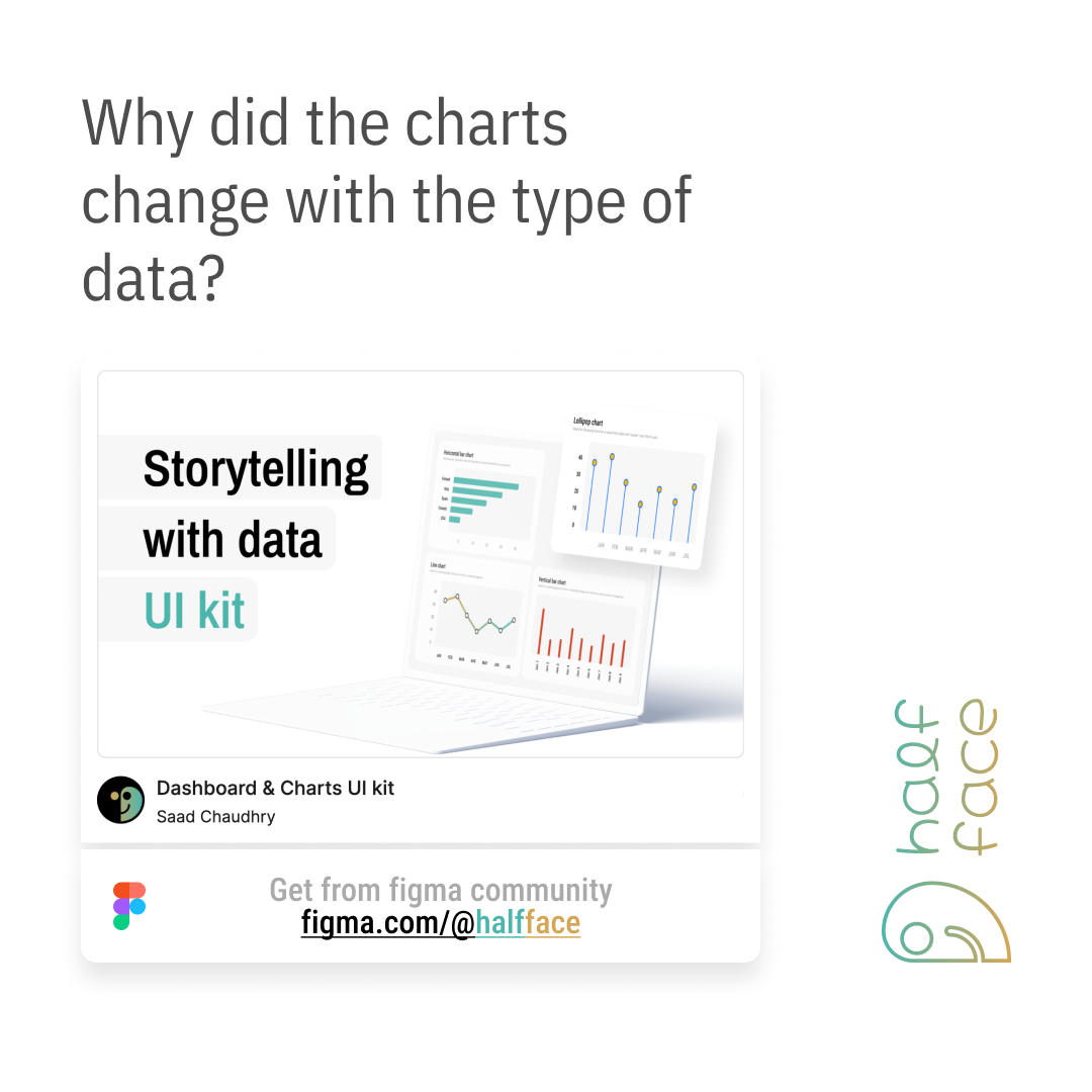
Storytelling with data
The descriptive texts are written by AI Agent. I draw the visual storyboard, and the agent narrates it.
Great dashboards don’t just display data—they tell a story. And every story begins with understanding your data. The key to picking the right chart lies in recognizing the 4 Levels of Measurement, a fundamental concept in statistics that determines what kind of insights we can extract from our data.
What is Level of Measurement?
Levels of measurement classify data based on how much information they contain and what we can do with them. Some data is just categorical, while others have numerical precision. Understanding these levels helps us decide how to visualize them.
From simple to complex, we have:
Nominal – Names and categories.
Ordinal – Ranked order but no defined distance.
Interval – Consistent differences but no absolute zero.
Ratio – Absolute zero exists, meaning values can be compared multiplicatively.
The more detailed the data, the more complex the chart can be.
Level 1: Nominal Data – Names, No Order
Nominal data is the simplest form—it categorizes without any inherent ranking. Think of cities, colors, or brands. Here, a bar chart works best, as it simply represents counts or frequencies without implying any order.
Level 2: Ordinal Data – Order Without Exact Differences
Ordinal data introduces order, but the gaps between values aren’t necessarily equal. Think of clothing sizes (XS, S, M, L, XL). Since order matters, a lollipop chart or a bar chart works well to show relative positioning.
Level 3: Interval Data – Equal Differences, No True Zero
With interval data, we know the spacing between values but lack an absolute zero. A classic example is temperature in Celsius. Line charts are great for interval data because they help show trends over time while maintaining equal spacing between values.
Level 4: Ratio Data – The Full Package
Ratio data is the most powerful—it has true zero, equal spacing, and meaningful ratios. For example, 20 years is truly twice as long as 10 years. Bar charts and histograms are perfect for ratio data since they allow meaningful comparisons.
The Takeaway
The way data is measured determines how we visualize it. Choosing the wrong chart can mislead, but choosing the right one can turn raw numbers into insights. Next time you build a dashboard, think about what your data truly represents—because the story it tells depends on how you show it.
Want to enhance your data storytelling? Get started with the Dashboard & Charts UI Kit on Figma. Explore more at figma.com/@halfface.


